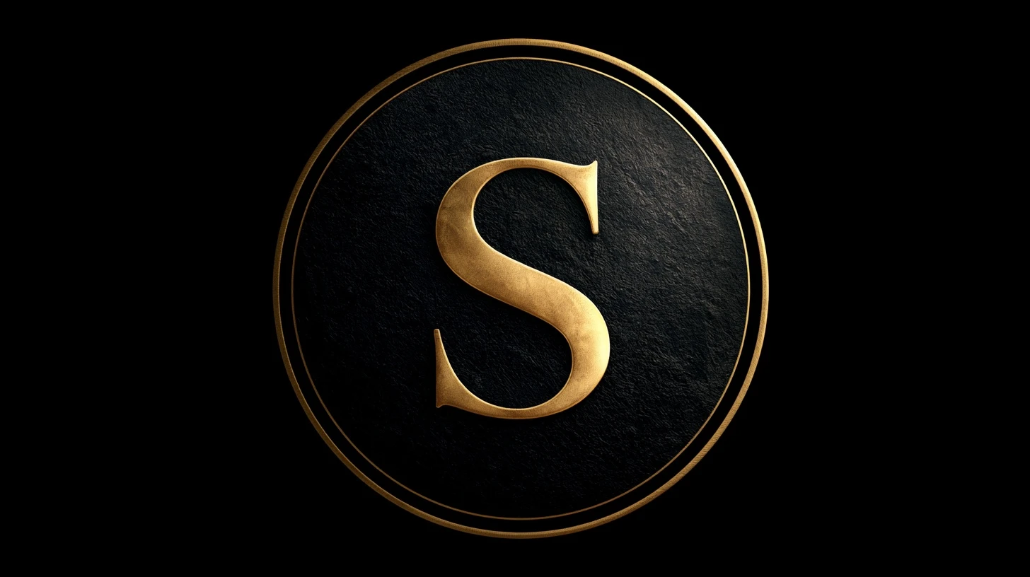
A letter DP is the most underrated profile picture format there is. It’s completely anonymous, it’s instantly recognisable, and — crucially — a single bold letter is one of the very few things that stays legible when your DP is displayed at 40 pixels. This guide covers S name DP styles, how to make one yourself, and why letters outperform almost everything else at profile size.
Why letter DPs work so well
Every guide on this site keeps returning to the same constraint: your DP displays at around 40 pixels. At that size, photographs lose their faces, illustrations lose their detail, and text becomes unreadable.
A single letter is the exception. It’s one high-contrast shape designed from the ground up to be recognised at speed and at small size — that’s what letterforms are for. An S at 40 pixels is still unmistakably an S.
Three further advantages:
- Complete anonymity. No face, no location, nothing identifying beyond an initial.
- It never dates. A letter doesn’t go out of style or become an old photo of you.
- You can make it yourself in five minutes with free tools, and own it outright.
S name DP styles
Bold letter on solid colour
A heavy sans-serif S, white on a saturated background. The highest-contrast option and the most legible at any size. Difficult to improve on.
Gold or metallic on black
A gold-gradient S on deep black. The most popular style in this category by some distance. Keep the gold bright — a dark metallic on black loses all separation.
Neon glow
A glowing letter on a dark background. The glow adds a soft halo that helps the shape read even when everything else is compressed away.
Script and calligraphy
An elegant flowing S. Looks beautiful at full size, but thin strokes are the first thing to disappear when downscaled. If you use script, pick a weight far heavier than seems necessary.
Letter with a crown
An S under a small crown. Extremely common, which cuts both ways — instantly readable, but not distinctive.
Two letters
An initial pair for couples or a full monogram. Works, but two letters at 40 pixels is close to the limit of legibility. Keep them large and tightly set.
Letter in a floral or leaf wreath
An S surrounded by botanical decoration. Softer and popular, but the decoration competes with the letter — keep it thin and let the letter dominate.
Making your own in five minutes
You don’t need design skills, and doing it yourself means the result is genuinely unique rather than the same stock image thousands of others are using.
- Open any free design tool — Canva, Figma, Photopea, or even a phone photo editor with text.
- Create a 1024 × 1024 square canvas.
- Fill the background with one solid colour.
- Add your letter. Choose the heaviest weight available — Bold or Black, not Regular.
- Scale it so it fills roughly 60–70% of the canvas height.
- Centre it precisely, both horizontally and vertically.
- Export as PNG.
The most common mistake is making the letter too small. It should feel oversized on the canvas. Once cropped to a circle and shown at 40 pixels, that boldness is exactly right.
Colour combinations that work
| Letter | Background | Effect |
|---|---|---|
| White | Deep red | Strong, classic |
| Gold | Black | Premium — the most popular |
| Black | Bright yellow | Maximum contrast possible |
| White | Navy | Calm and clean |
| Neon cyan | Near-black | Modern, glows at small size |
| Deep purple | Soft pink | Softer but still readable |
| White | Forest green | Distinctive, uncommon |
| Silver | Charcoal | Subtle — needs a bright edge |
The rule underneath all of these: one light element, one dark. Two mid-tones produce a grey blur.
Font choices
Best at small size: heavy geometric sans-serifs. Thick, even strokes with generous counters — the enclosed spaces inside letters — stay open when downscaled.
Use with care: serif fonts. The thin serifs vanish first, though a heavy slab serif works well.
Hardest to get right: script and handwriting fonts. Thin connecting strokes disappear almost immediately. If you want script, pick the boldest weight you can find and scale it up further.
Avoid: outline-only fonts, anything with fine decorative detail, and very condensed faces.
Other letters
Everything here applies to any initial. A few letter-specific notes:
- Round letters (S, O, C, G, Q) fill a circular crop naturally — an advantage.
- Narrow letters (I, J, L, T) leave a lot of empty space. Scale them larger or add a subtle background shape.
- Wide letters (M, W) may need slightly reducing to fit inside the circle with margin.
- Similar pairs (O and Q, I and J) can be ambiguous at 40 pixels. Choose a font that distinguishes them clearly.
The circle crop
Every platform crops DPs to a circle, cutting about 21% from the corners of a square image.
For letter DPs this is straightforward — centre the letter and keep it within roughly 70% of the canvas width. Nothing important should sit near the corners.
Sizes by platform
| Platform | Upload size |
|---|---|
| 640 × 640 min, 1024 × 1024 ideal | |
| 1080 × 1080 | |
| 720 × 720 | |
| Discord | 1024 × 1024 |
| Telegram | 512 × 512 |
Always PNG. Letterforms are flat colour with hard edges, which is exactly what JPG compression handles worst — you’ll get visible fringing around every stroke.
Common problems
The letter looks thin and weak
The font weight is too light. Switch to Bold or Black, and scale up.
Coloured fringing around the edges
Saved as JPG. Re-export as PNG.
The letter is cut off
Too large for the circular crop. Keep it within about 70% of the canvas width.
It looks flat and boring
Add one subtle element — a slight gradient on the letter, a soft glow, or a thin ring just inside the crop edge. One addition, not several.
Related guides
- New WhatsApp DP ideas
- Black DP for WhatsApp
- Girls DP images
- Attitude cute cartoon DP
- Broken and sad DP
Frequently asked questions
What is an S name DP?
A profile picture built around the letter S — usually a bold or decorative letterform on a contrasting background — used by people whose name begins with S.
How do I make an S name DP?
Create a 1024 × 1024 square in any free design tool, fill it with one solid colour, add a heavy-weight S filling 60–70% of the height, centre it, and export as PNG.
Why are letter DPs so popular?
They’re anonymous, they never date, and a single bold letter is one of the few things that stays legible when a DP is displayed at 40 pixels.
What is the best font for a name DP?
A heavy geometric sans-serif. Thick even strokes and open counters survive downscaling; thin scripts and fine serifs disappear.
Should a name DP be PNG or JPG?
PNG. Flat colour with hard edges is exactly what JPG compresses worst, producing visible fringing around the letter.




Leave a Reply